Android M is Google's main announcement during the Google I/O 2015 launch keynote. The successor to Android Lollipop will arrive with its share of rather interesting new features. If Android Lollipop marked a real graphical turning point with Material Design, Android M will improve Google's OS in depth. Overview of the new features of Android M.
- Read also: Google I/O, here are all the announcements you shouldn't miss

The drawer interface will be clearer
As we told you above, Google will not bring any major changes in terms of interface. The Material Design is preserved and will be improved by small touches here and there. The most visible change will come from the applications drawer or menu.
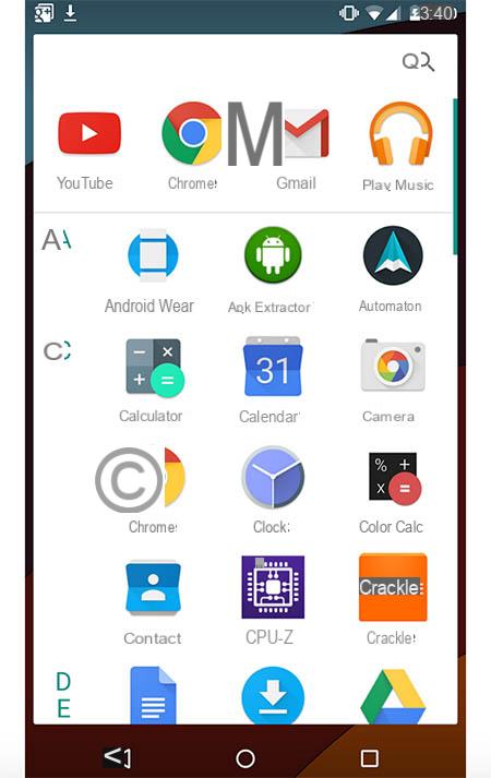
Google has chosen to review the interface of this very important section for Android smartphone users. The menu will therefore be clearer and the presentation of the various widgets will no longer be horizontal but vertical. It will take some getting used to.
A new dark theme
All Android users will agree, Google likes to send colors. The interfaces are clear, colorful with a dominance of white. The problem is that not all users are fans of light themes and prefer darker shades.
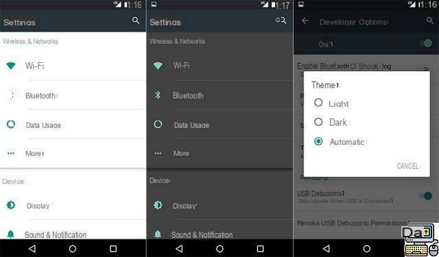
With Android M, it will be possible to choose between a light theme (which you already know) or a dark theme. You can switch as you see fit between the two and it will even be possible to customize the passage from one theme to another automatically according to the context. Not bad is not it ?
Better autonomy with the “Doze” mode
This is the kind of announcement that Google repeats each time a new OS is released: “this version will improve the autonomy of your smartphones”. Android M has not escaped either and we sincerely hope that this time Google will keep its promise.
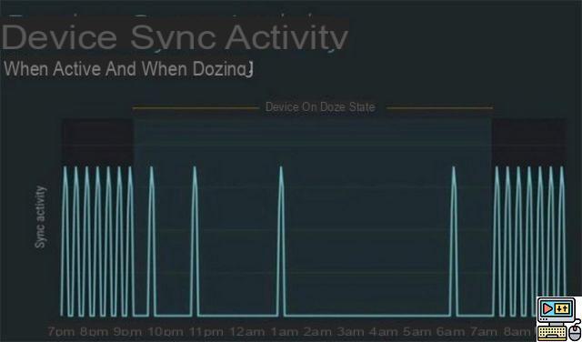
With the “Doze” mode, the firm promises that smartphones with Android M will see their autonomy improved, in particular thanks to better energy management when the phone is on standby.
The OS will somehow sort between priority apps and notifications to save battery. Google promises doubled autonomy on the Nexus 9, we are waiting to see.
- Read also: Everything you need to know about Android M's Doze mode
RAM management reviewed and corrected
As rumors had suggested, Android M will have a function to better manage RAM. Now a much clearer dedicated page will tell you which applications consume the most RAM but also the average consumption.
SD cards assimilated to internal memory
This is one of the new features that Google did not announce yesterday during its keynote but which will delight users. This information was unearthed in the documentation given to the developers. With Android M, SD cards will be considered internal memory.
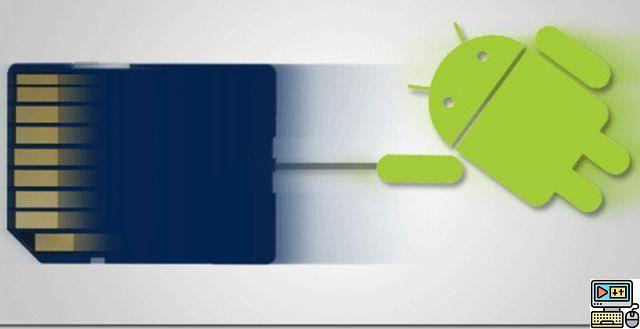
When the user inserts the card in his smartphone, he will have the choice between using it as a classic SD card or assimilating it to the internal memory. If he chooses the second solution, Android M will consider that this SD card is an integral part of the smartphone's memory. Applications, for example, can be installed there.
However, this card can only be used on this device from the moment this choice is made. Not enough to convince manufacturers to stop offering smartphones without an SD port.
- Learn more about SD card support on Android M
A new permissions system for applications
This is undoubtedly one of the most interesting novelties. At least for those who like to control their private data. With Android M, app permissions will be managed more easily.
While for the moment it is necessary to manage the authorizations with each application installation, it will now be possible to organize them all from a dedicated interface which is reminiscent of what is found on iOS.
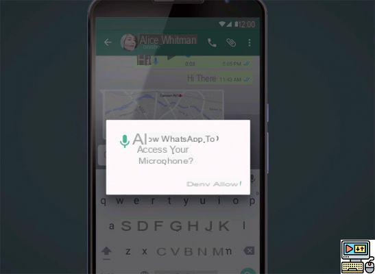
In the same way, the applications will ask during the first start to validate all the authorizations via a pop-up window. The main permissions concern SMS, calendar, photos, contacts, etc. It's more intuitive and efficient.
Finally bridges between applications
You have all experienced it at least once. When you open an email with a link to an address, for example, you are asked with which application you want to open this information (Google Maps, Waze etc.).
This era will soon be over since Android M will allow you to create bridges directly between applications. For example you receive an email from Instagram leading to a photo. The Instagram app will open directly when you touch the photo link.
Silent Mode is making a comeback
That was Android Lollipop's biggest aberration: the disappearance of silent mode. For once, it was a real failure on the part of Google since even a 3310 has silent mode. Android M will therefore sign the return of this function, and as if to be forgiven, it also offers a new, simpler volume control system.
A fully customizable quick access bar to settings
The title pretty much says it all. With Android M it will now be possible to fully customize the quick settings bar. A real good idea that we already find in some Custom ROMs but that Google had still not integrated into its mobile OS.
USB-C, the new standard
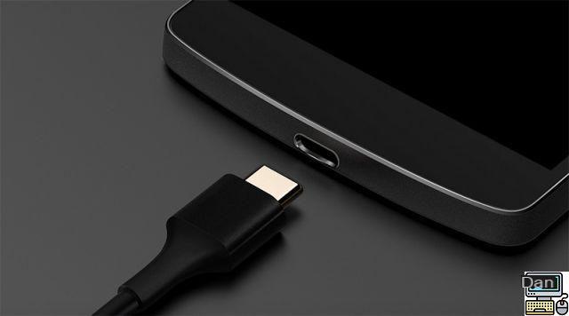
We heard about it a while ago now, USB-C will become a standard on Google smartphones and will allow you to search 3 to 5 times faster. We have already seen the new Apple MacBook equipped and the Nokia N1 display this technology, the next Nexus will also be equipped with it. Moreover, during the keynote, a photo of a smartphone that could well be the next Nexus appeared.
Android Pay and native fingerprint recognition
Again it was not a surprise since the rumors had been talking about it for weeks. Google itself had announced Android Pay, the payment service similar to Samsung Pay or Apple Pay. It is now official and will perform the same functions as its “competitors”: paying for apps, making in-app purchases and of course taking advantage of contactless payment.
To strengthen payment security, Google has also announced native support for fingerprint recognition on Android M. Thus the user will be able to validate his payments thanks to the fingerprint reader but also to unlock his smartphone. We already know, but Google is getting started.
Google Now is even stronger (than Roquefort)
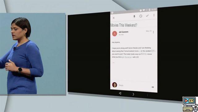
One of the most interesting demonstrations yesterday was undoubtedly that of Google Now. With Now on Tap, the assistant becomes even smarter. It takes into account the context in which the user finds itself better than ever and adapts its responses and even acts alone without the user having to do anything.
- All about: The new features of Google Now and On Tap
To activate Now on Tap, simply make a long press on the home “button” to trigger it. For example, I read an email from a friend who suggests I go see a movie. I do not know this film. I say it to Google Now (“What is this film?”) and without even having the title or the names of the actors it will give me a complete file on the film in question. Magic.
Direct Share: Google unveils its AirDrop
iOS users have AirDrop, Android users will now have Direct Share. For those who don't know, AirDrop allows you to exchange files between Apple devices thanks to a fast process that mixes Bluetooth (for pairing) and Wifi (for file transfer).
Google is now doing the same with Direct Share. No need to go through the cloud or send an email while the recipient is in front of us. Professionals will appreciate.


